Element Youth Website Case Study
Redesigning the Element Youth Group Web Experience
The Problem
The Element Website struggled with poor content organization, unclear navigation, and inconsistent design elements that didn't reflect the atmosphere or values of the group. Addressing this could build a greater sense of trust and engagement among parents and youth.
Gathering Insights
User Interviews
I conducted a few user interviews with middle schoolers, youth leaders, and parents to understand the general impression of Element and assess the process of getting information. Here’s a sample of some of the questions I asked:
What is your initial impression of Element Youth Group?
How easy or difficult is it for you to find information about upcoming events?
How would you describe the website’s navigation?
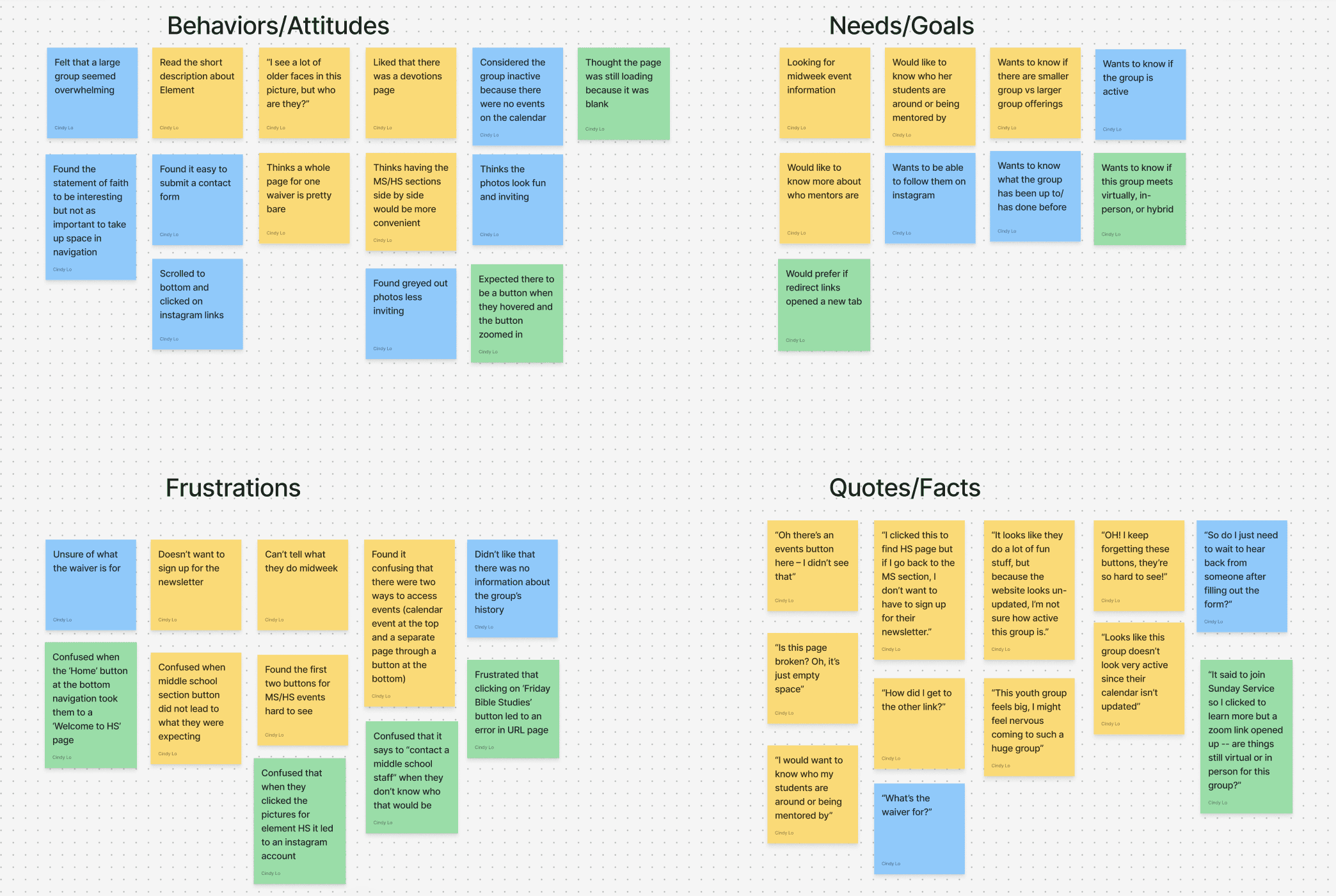
Sorted Stickies into User Needs & Pain Points
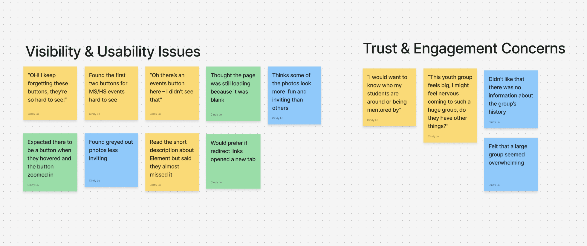
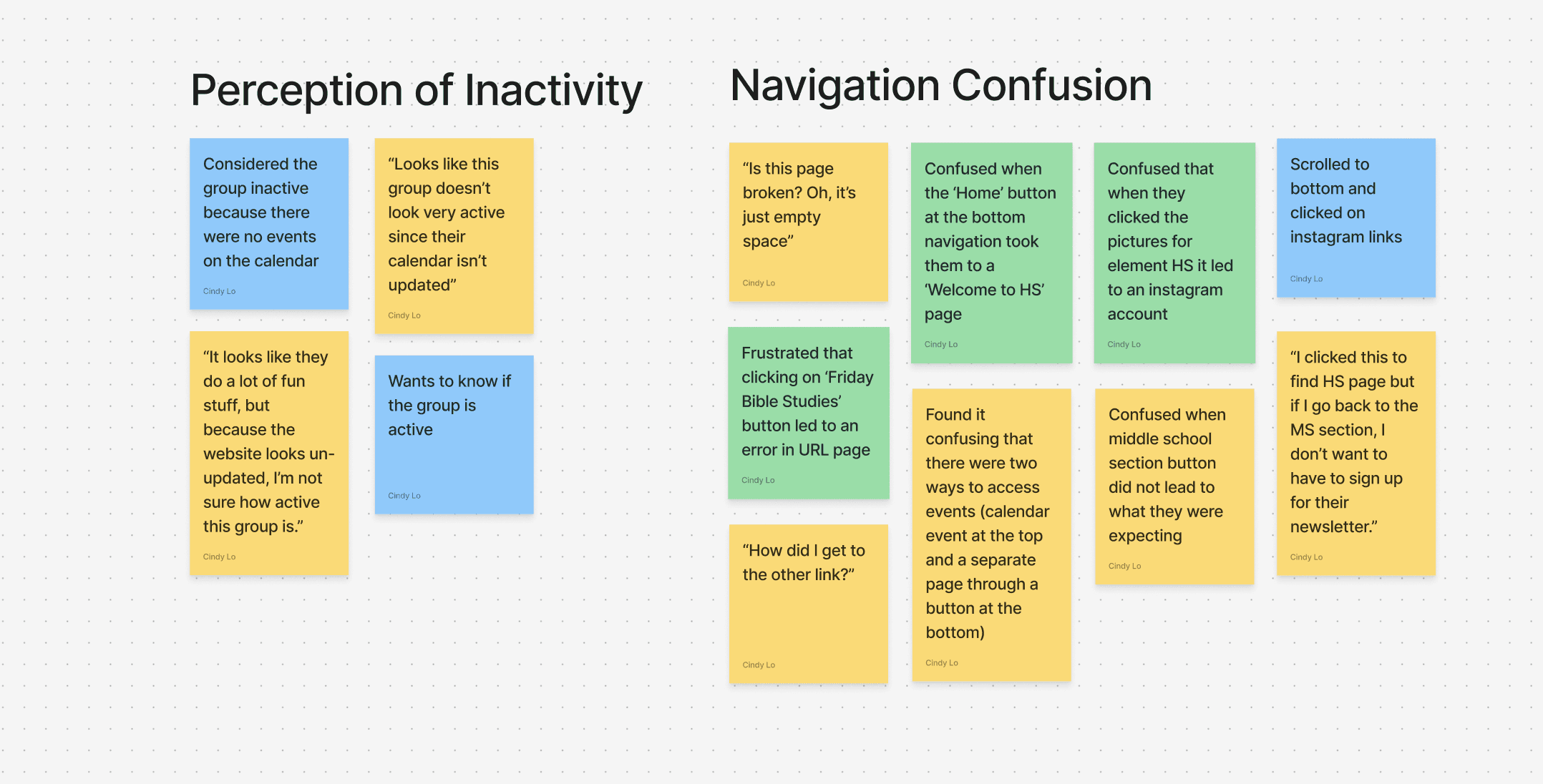
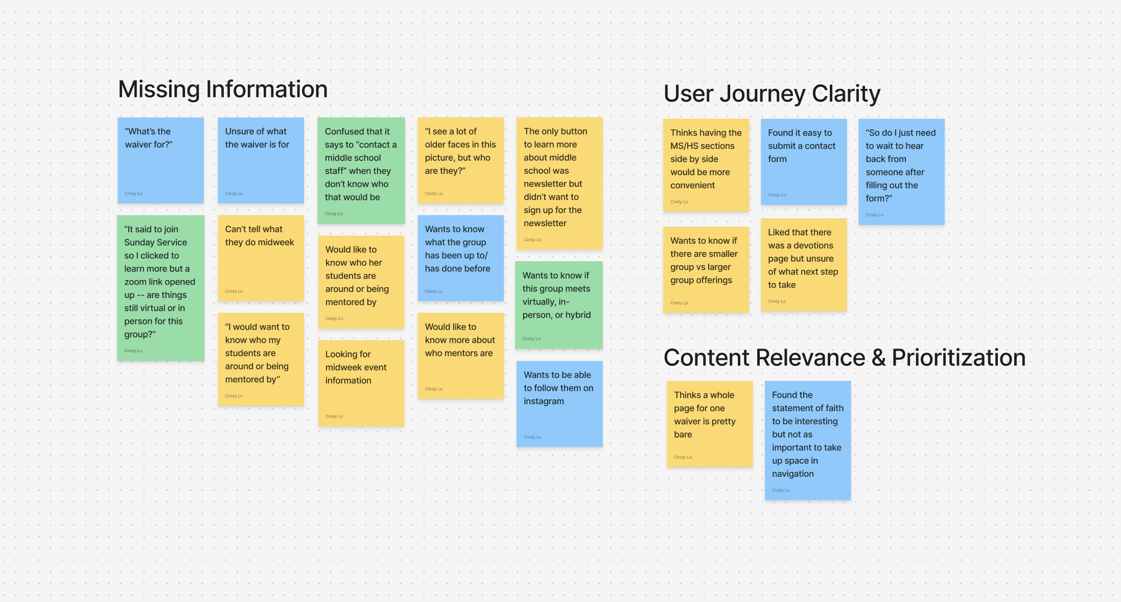
I then used affinity mapping to better identify relationships and common themes from these data points. These are the 7 themes that emerged:
Visibility & Usability Issues
Trust & Engagement Concerns
Perception of Inactivity
Navigation Confusion
Missing Information
User Journey Clarity
Content Relevance & Prioritization
Feel free to click through to view the maps below:
Key Findings
Homepage Design Lacked Visual Hierarchy
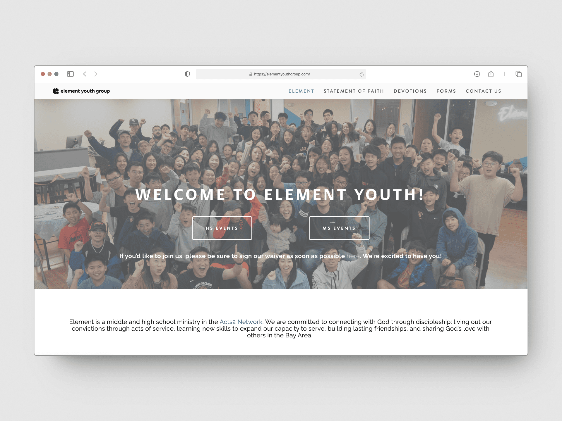
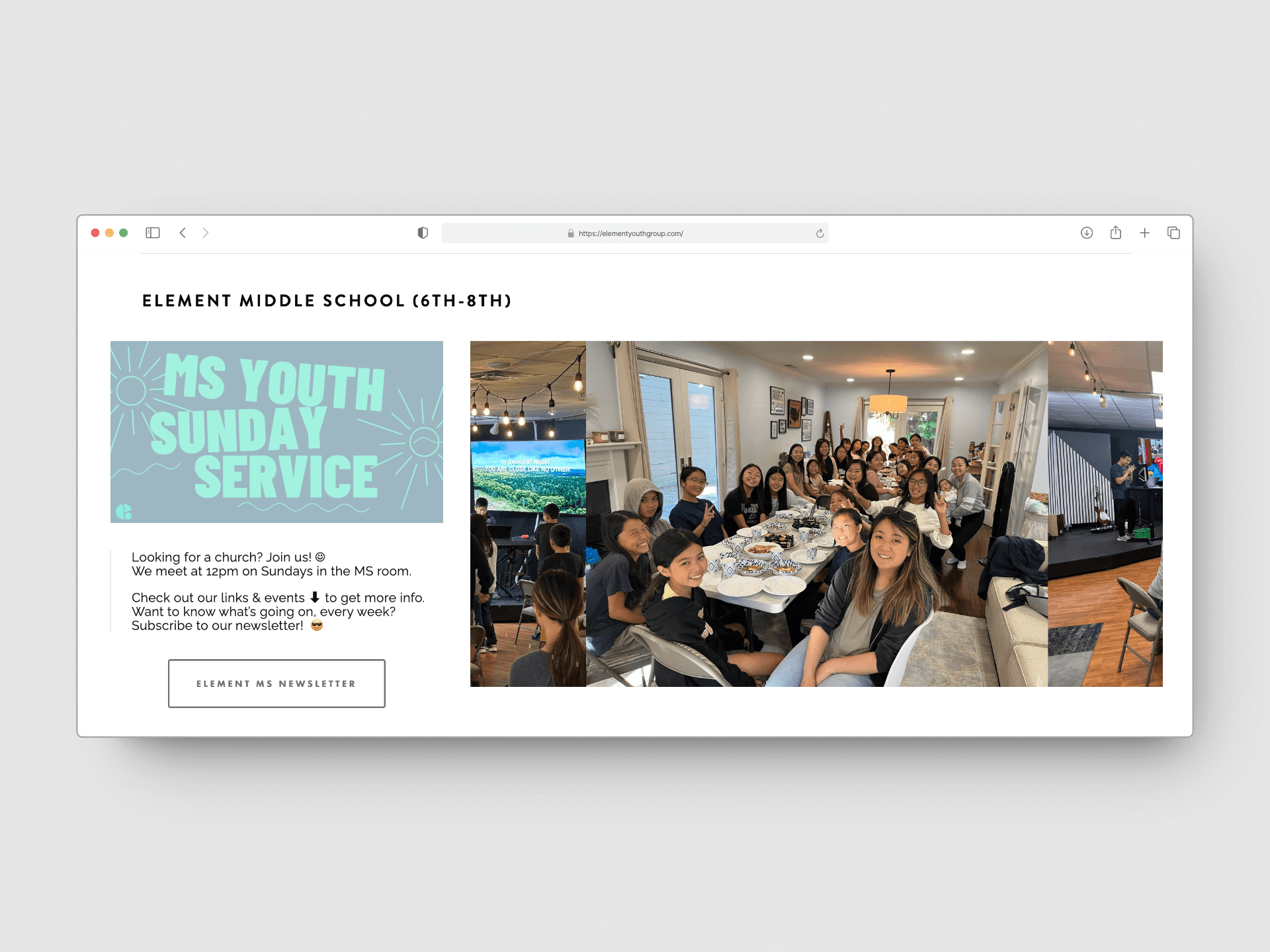
The Element logo appeared too small, reducing its presence, and welcome messages were difficult to read due to poor contrast with the background color. The homepage content was dense and lacked intuitive titles or section headings, making the flow unclear. Button sizes were also too small, which could hinder accessibility for parents. Additionally, the visual layout of high school and middle school sections felt misaligned, with inconsistent image grids and awkward photo bleed.
01 - Original Homepage Design
02 - Middle School Section on Homepage with Inconsistent Image Bleed & Option to Signup for Newsletter
Navigation Paths were Confusing
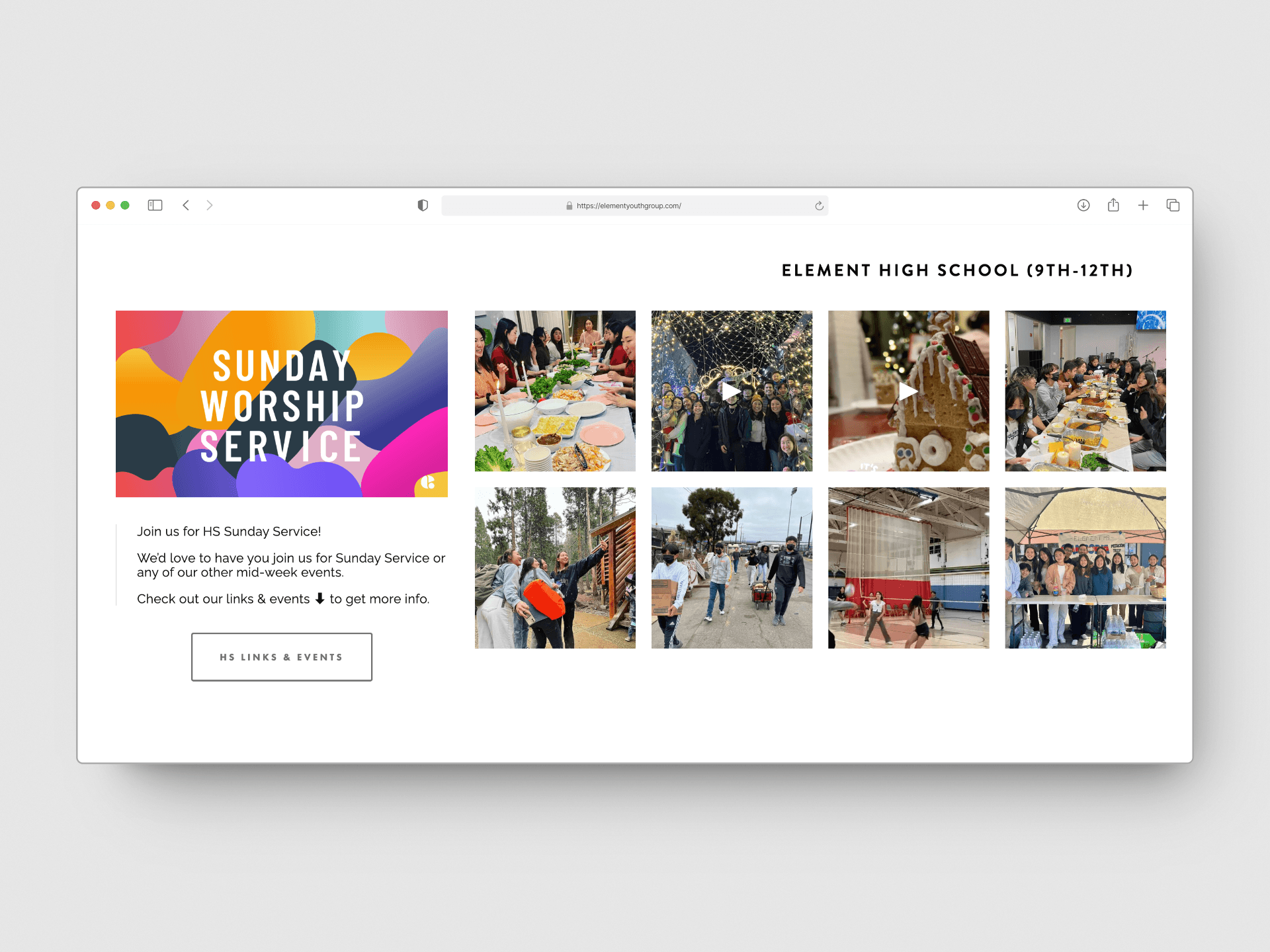
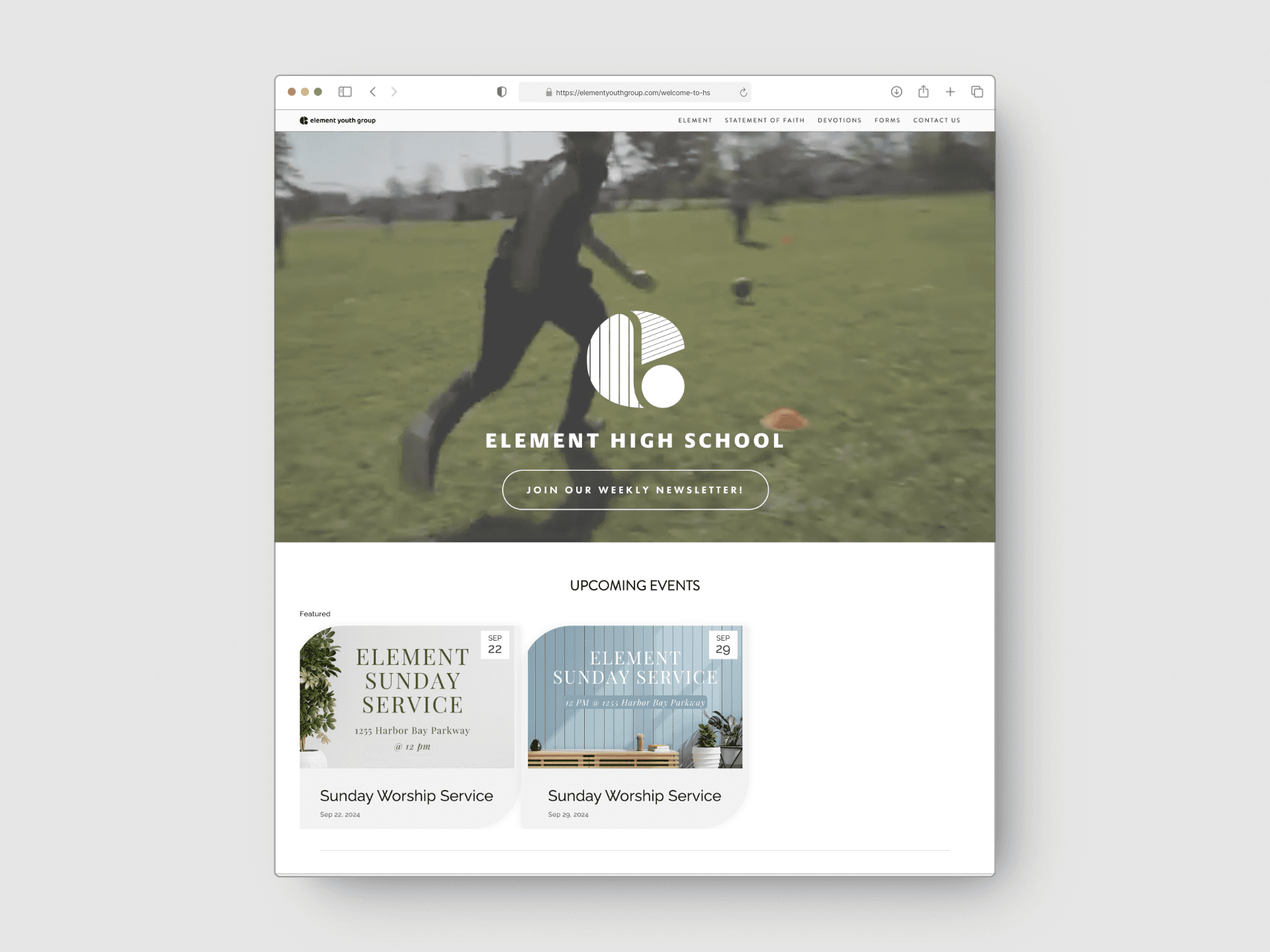
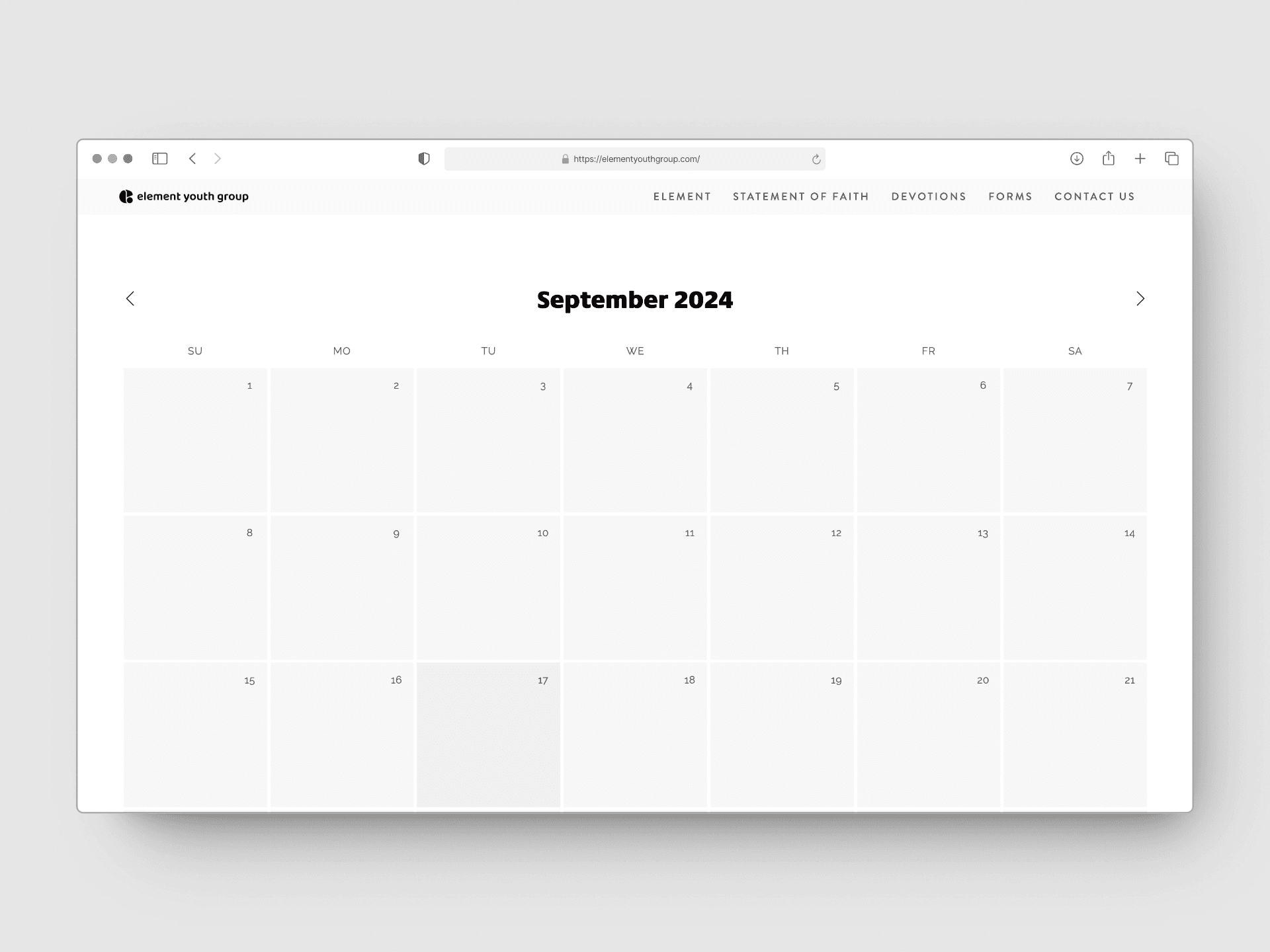
Buttons and links led to incomplete or incorrect pages, such as high school event pages with missing calendar entries. There was also inconsistency in linking, with high school images connecting to Instagram but middle school images not doing so. Furthermore, the high school section featured a button linking to a separate high school page, while the middle school section offered only a newsletter signup without a dedicated page.
03 - High School Section on Homepage with HS Links & Events Redirect (See Image 04)
04 - A Separate HS Home Page
05 - Event Pages with Missing Calendar Entries
Missing Information from Crucial Pages
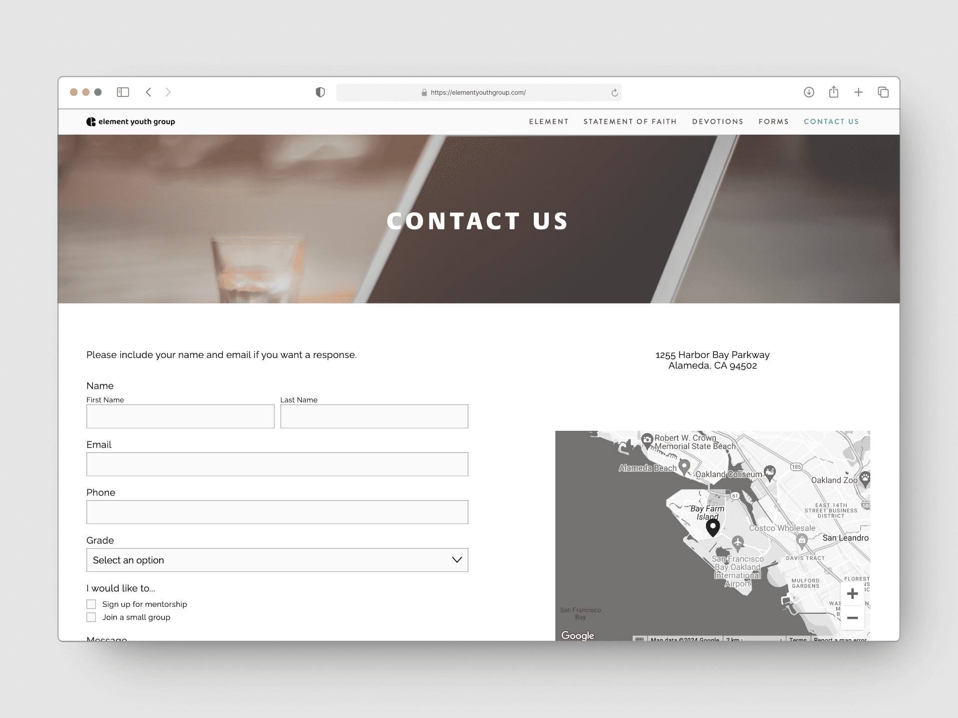
The contact form allowed submission with only one field completed, and some site features, like the devotions page, were blank or non-functional. Additionally, parents were unclear about staff involvement, emergency contacts, and group logistics without a clear dedicated section.
06 - Contact Us Page
The Solution
An Engaging, Student-Centric Design with Parent-Friendly Navigation
Design Process
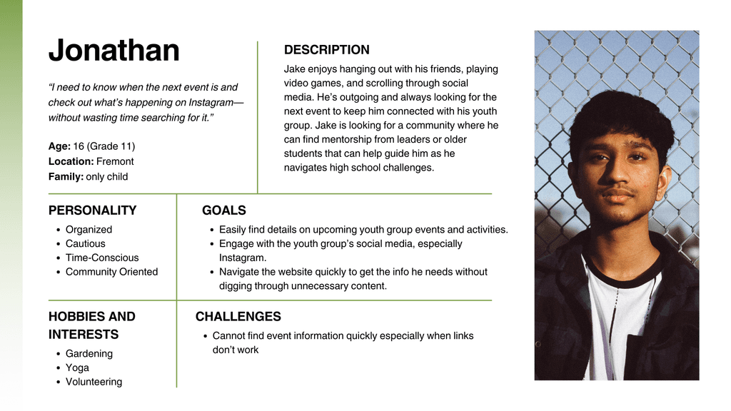
Personas & User Stories
To ensure the website met the needs of all users, we developed three key personas: parents, middle schoolers, and high schoolers. By mapping out their user journeys, these personas helped us identify pain points and design opportunities.
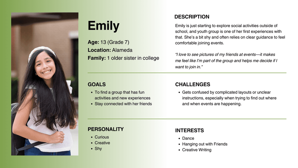
For example, a parent who tends to prioritize safety and reliability, would experience frustration when they look at the website unable to find details about the organization, group logistics, or staff credentials. On the other hand, students are more interested in seeing what a group's atmosphere is like, and tended to be drawn to pictures of people. Additionally, students tend to navigate websites quickly, and lost interest when they found the website hard to navigate. Feel free to expand the user personas below if you would like a more detailed look.
As a result, we focused on keeping navigation intuitive and simplified, while being sure to incorporate photos and key information that our personas sought out.
07a - Lisa, a mother of 3 from Oakland
07b - Emily, a 7th grader from Alameda
07c - Jonathan, a high school junior from Fremont
Design Process
Rethinking Content Architecture
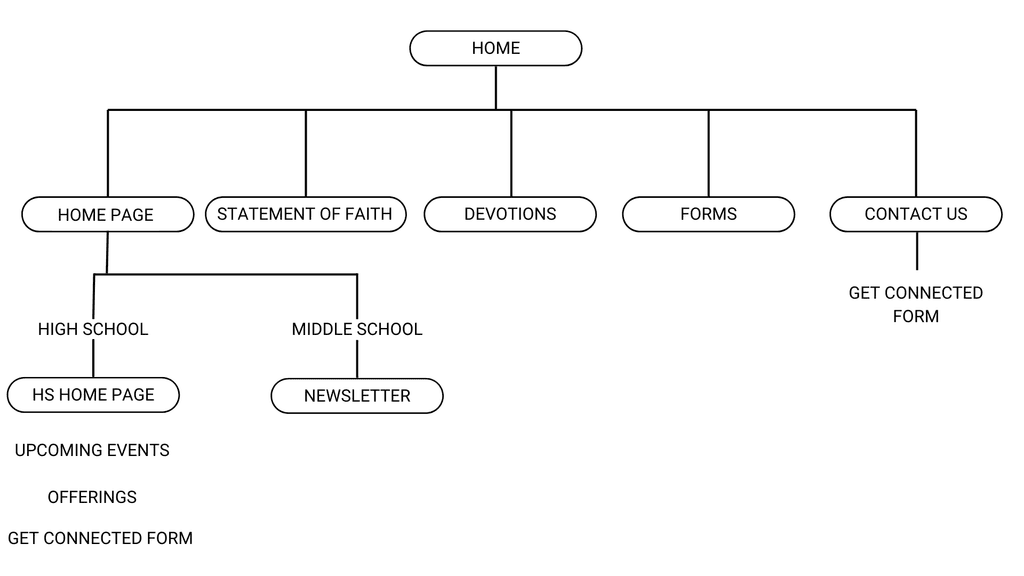
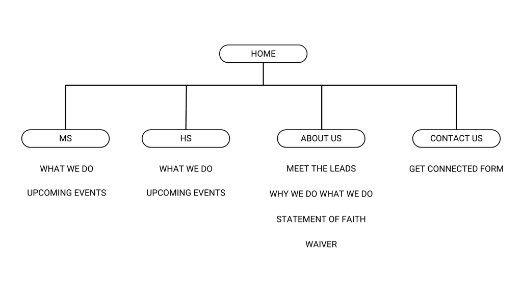
We restructured the content architecture to streamline navigation and eliminate redundancies. This involved creating distinct homepages for both high school and middle school, ensuring intuitive paths for users to find relevant content. We also added clear, descriptive headings to improve the readability of the introductory sections and organized the visual hierarchy to guide users through the site more effectively.
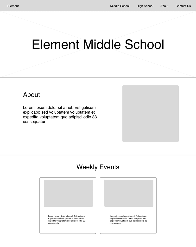
Our wireframes, using this simplified navigation, focused on visual hierarchy –– ensuring that important elements like the logo, welcome message, and call-to action buttons were prominent and easy to find.
08a - Previous Content Architecture
08b - Updated Content Architecture
Design Decisions
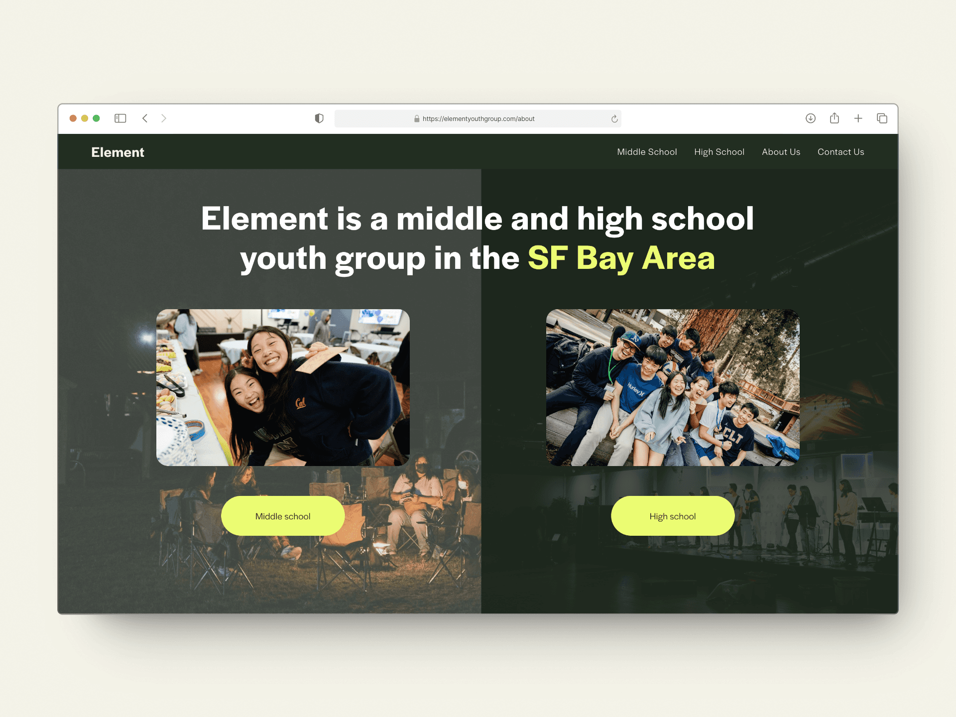
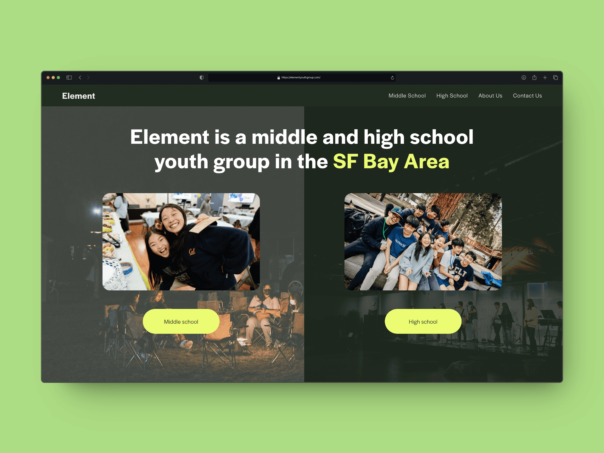
Since Element is broken down into two age brackets (middle and high school), we opted for the landing page to have two options that would make it clear for visitors which page to go to for group-specific information. Each page would then have its own relevant event information and locations.
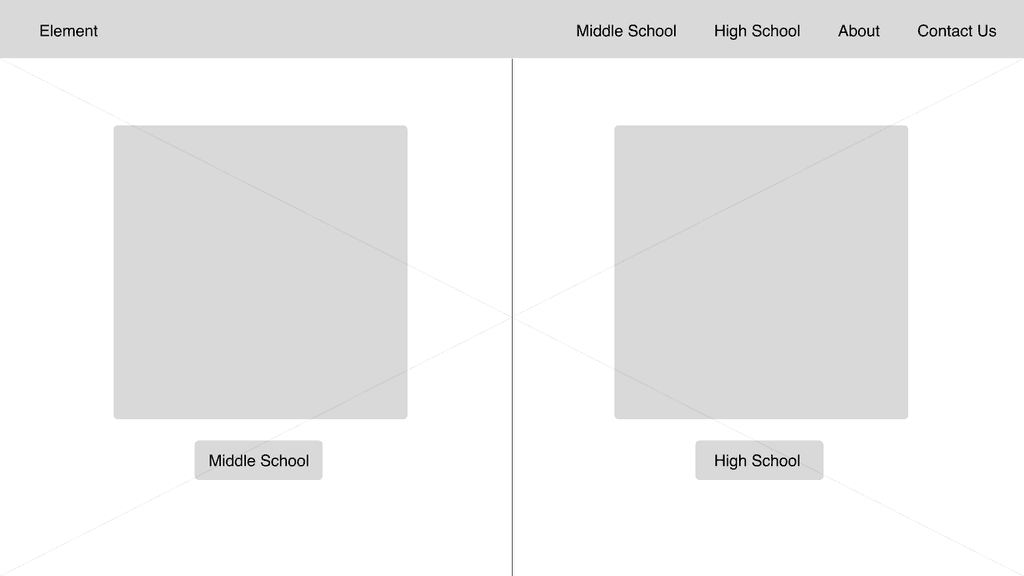
Lo-Fidelity Wireframe for Landing Page
Lo-Fidelity Wireframe for Middle School Page
Design Decisions
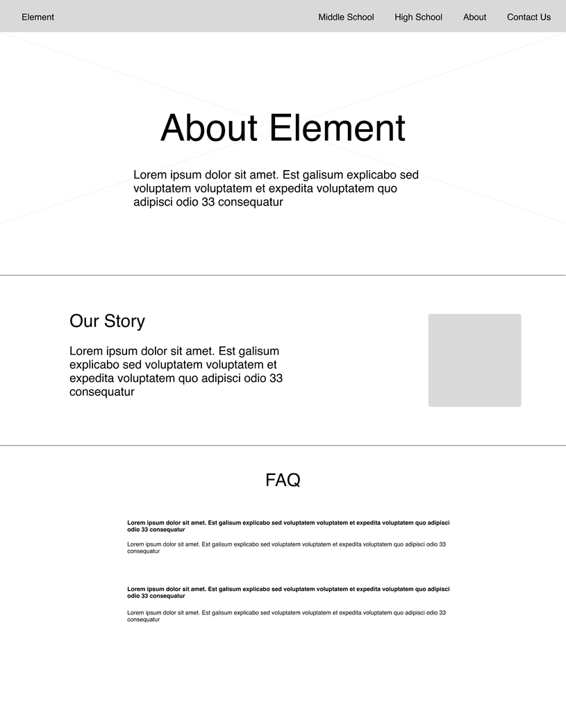
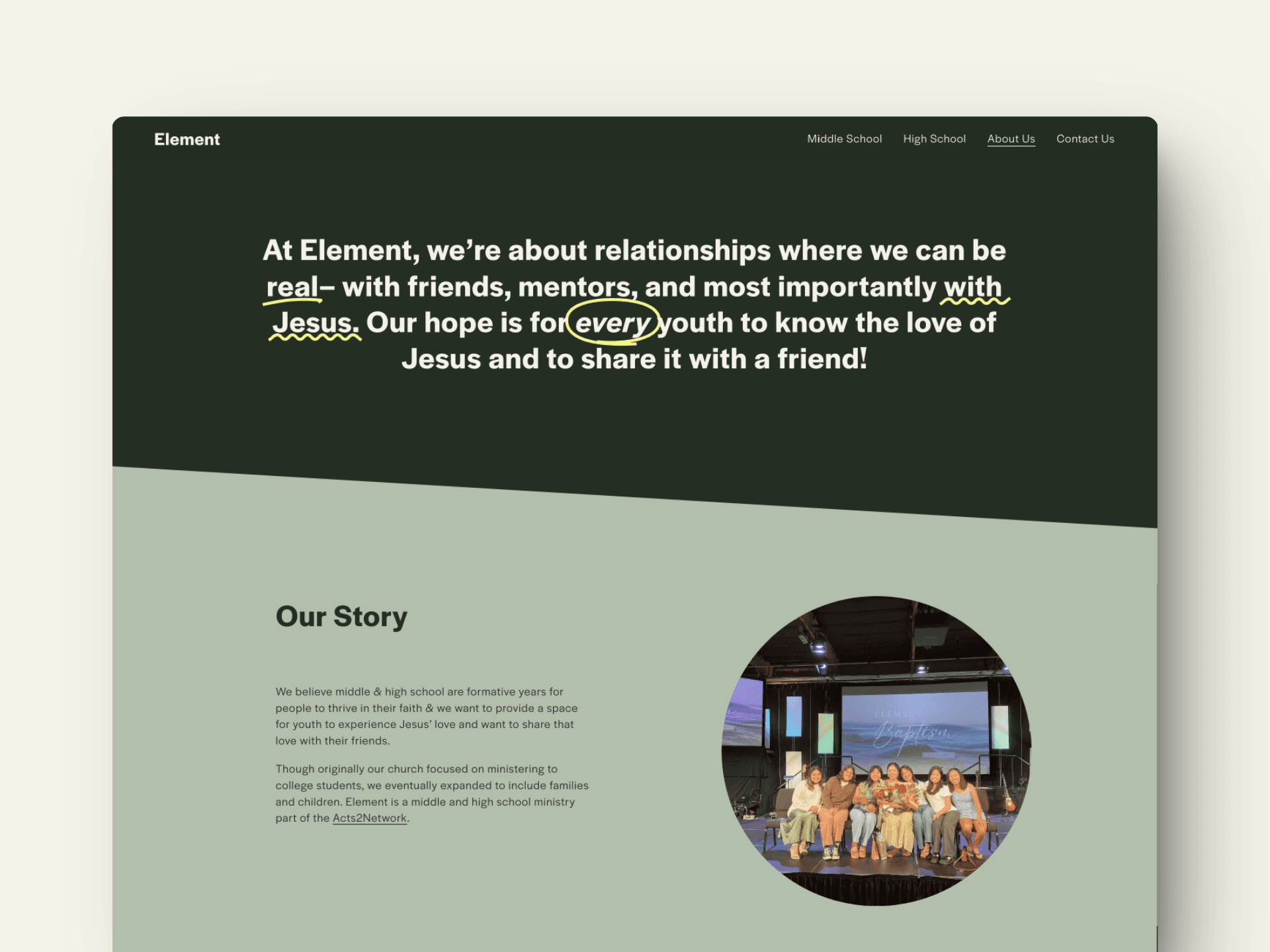
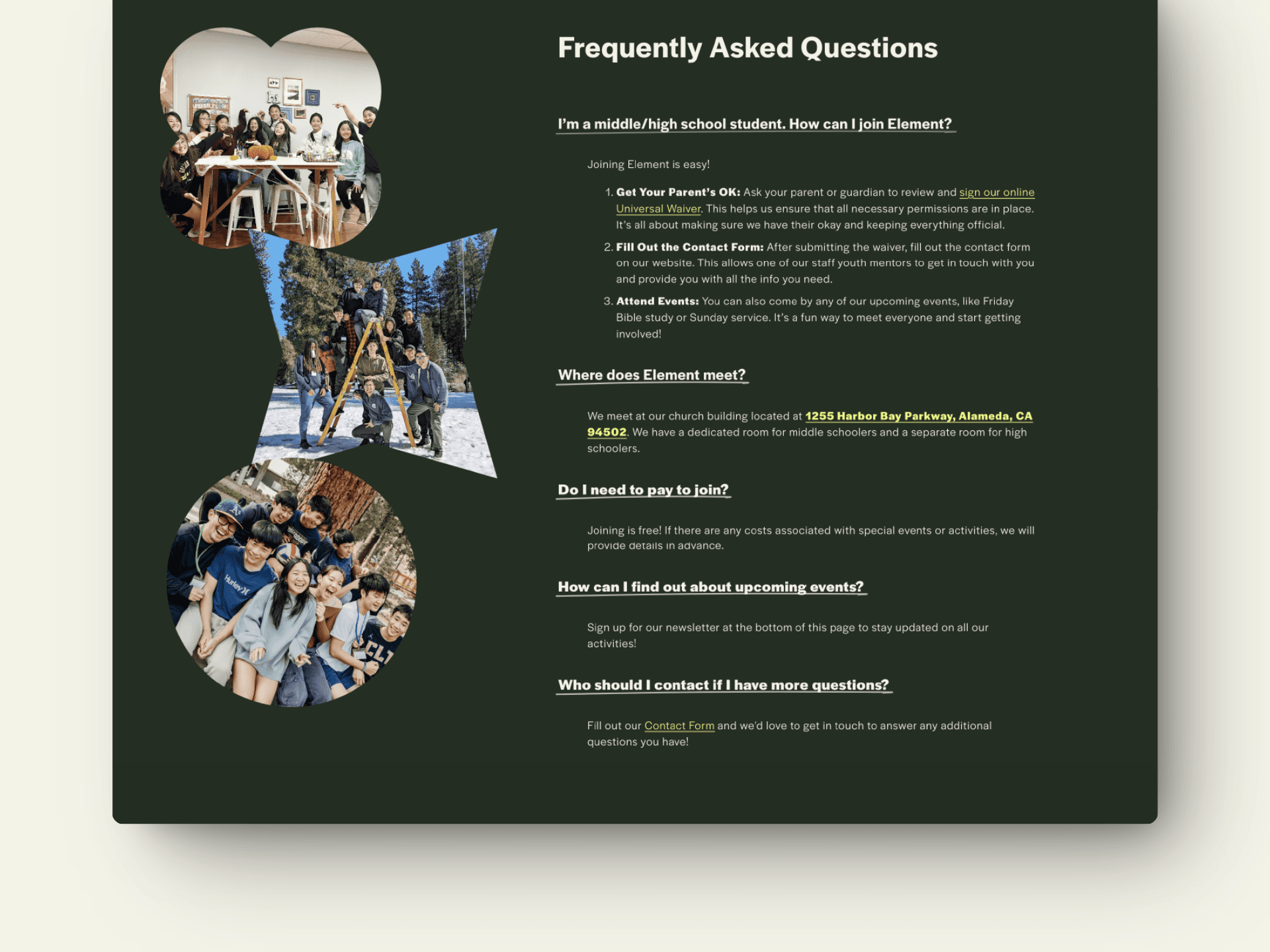
We streamlined the website to include an about page containing any key information. Whether you're looking for contact details, important waivers, a neat backstory, everything you need is just a click away.
About Page with an FAQ
Final Design
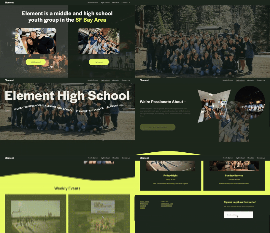
The redesigned site features a more vibrant, modern look that resonates with students. We chose to include clear, high-quality imagery and interactive elements that communicated higher energy. Additionally, we simplified navigation pathways, making it easier for parents (and students) to find event details according to their age groups (middle or high school), or group history and leadership information.
Updated Homepage
About Page
FAQ section on the About Page
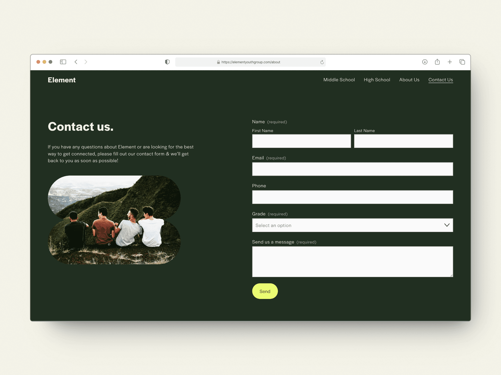
Contact Page
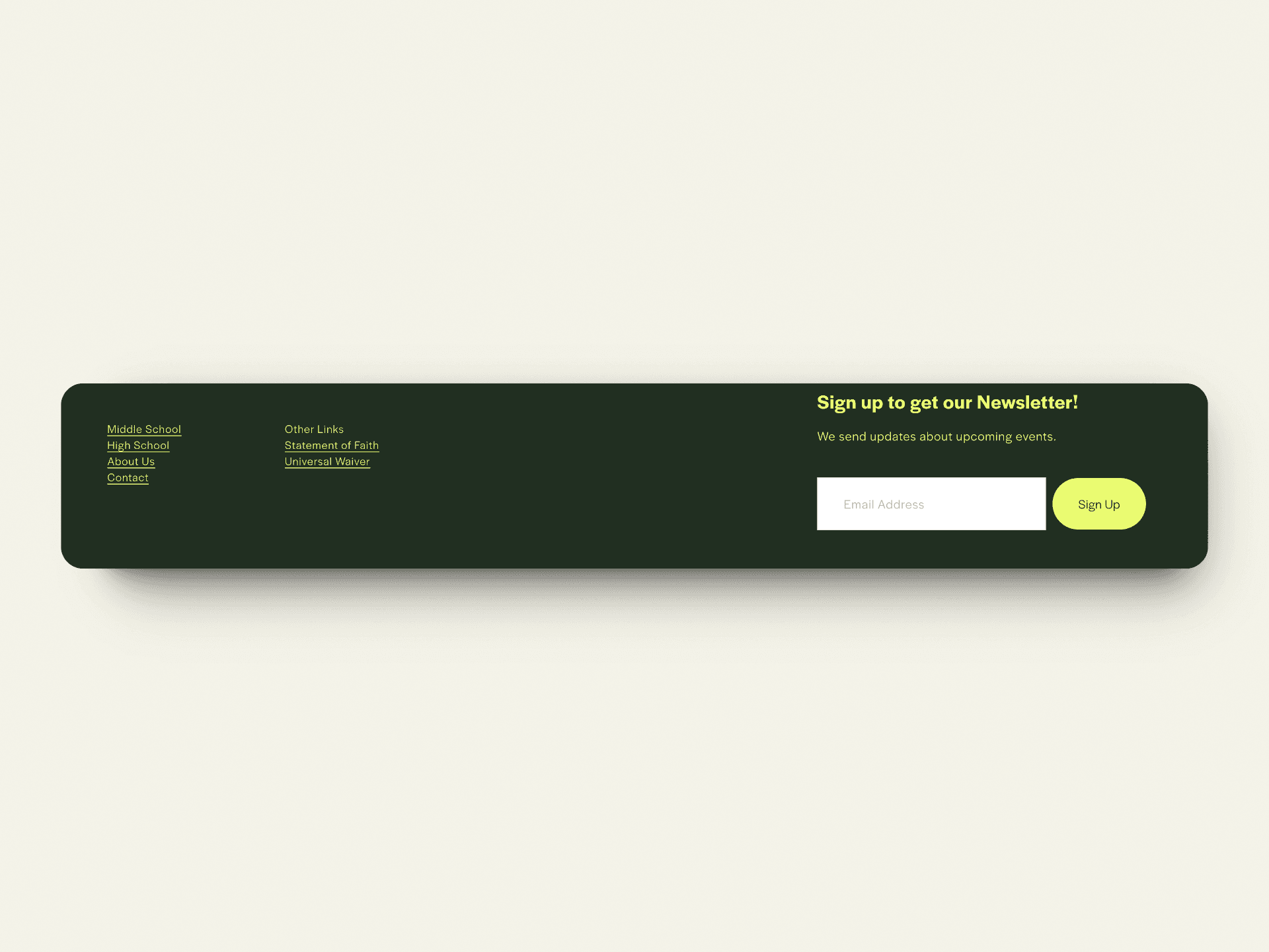
Simplified Bottom Navigation
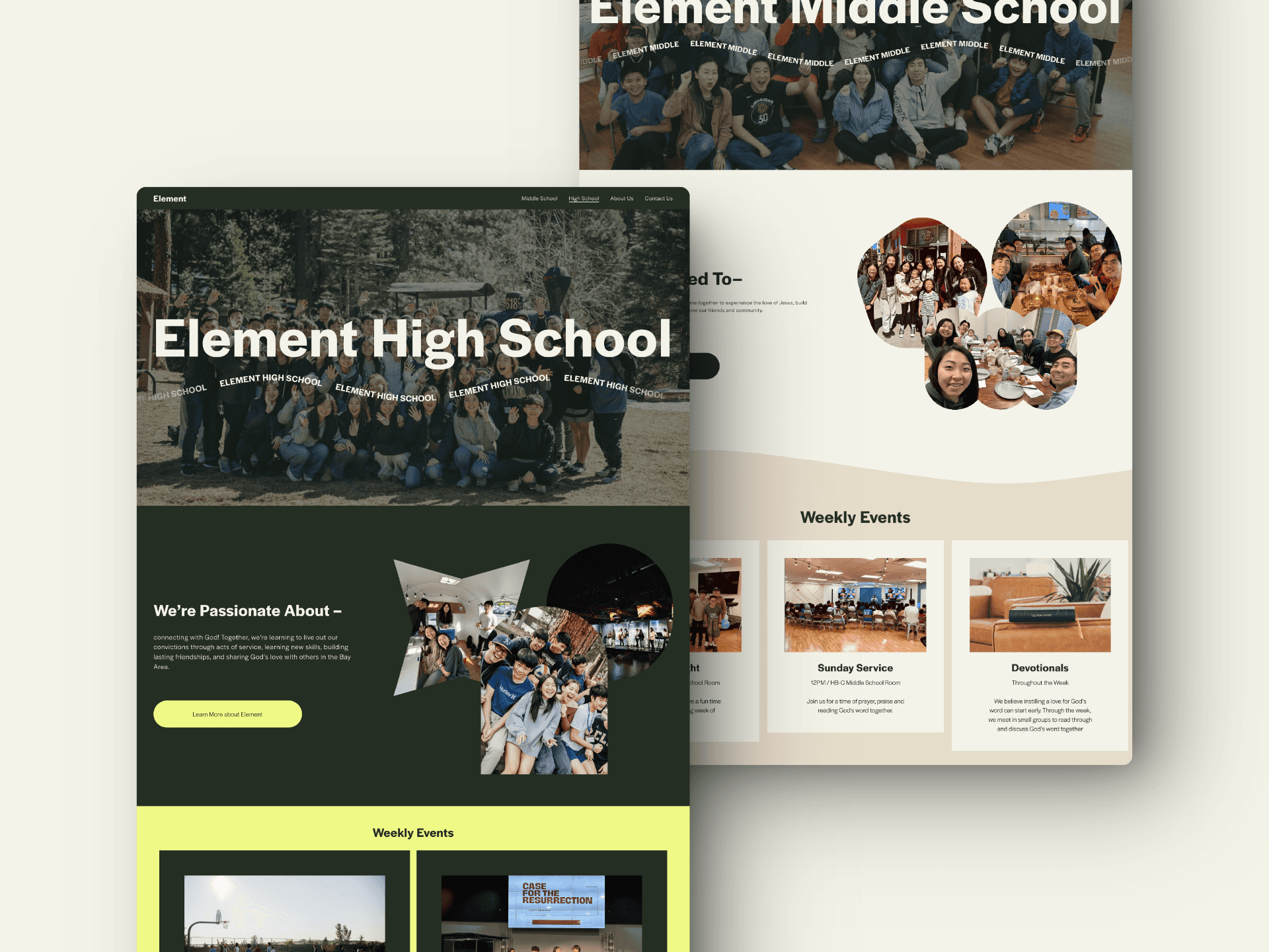
High School & Middle School Pages
Results & Learnings
The redesigned Element website addressed both student engagement and parent concerns, creating a more intuitive, visually appealing experience with significant improvements in usability, navigation, and overall clarity.
Although there is still room for future development, such as adding more event information, potentially including photos of the meeting spaces, or even adding service opportunities and resources, the project successfully laid the foundation for a more effective and engaging platform. This project reinforced the importance of balancing the needs of diverse audiences, especially when designing for both youth and adults. We learned the value of clear content architecture and consistent visual language in enhancing usability and engagement.

